I'm Lucy, 17 years old and studying A Levels at Welling Sixth Form. Here you'll find my coursework for Media as I look at title sequences and eventually create my own.
Looking back at your preliminary task, what do you feel you have learnt in the progression from it to the full product?
Overall, I think our full product was very successful in conveying the genre of our film idea. Our film idea includes a complex plot, yet our title sequence gives the audience explicit hints such as the gravestone and extreme close up of the cut throat. The clear display of the two narratives by using effects also worked well, especially teamed with the typography, as these had were both jittery and emphasised the creepy tone of our title sequence. It was made successful by our research into various existing title sequences of the same genre, and helpful feedback from our target audience. The weaker aspects of our title sequence were the planning stages, as our time was restricted due to the changing of groups and missing some lessons. This caused us to have a weak ending to our title sequence, which seemed like a resolution to our product. This was not our original intention and to improve on this, I would include more shorter shots similar to the cut throat. I would also have a more sudden ending to keep the audience on edge and engaged.
What have you learnt about technologies from the process of constructing this product?
During pre-production we decided we wanted to use basic technologies such as a DLSR camera and tripod when filming our title sequence. This is because our production company we created, Armored Ink Productions, is an independent film company, therefore would not have a large budget for expensive and excessive equipment. Besides a DSLR camera and tripod, we did not use any other technologies to film with. This was also because we thought the conventions of a horror/thriller film would best be created in post-production, such as adding effects in Final Cut Pro. Through this process, I have learnt that you do not necessarily have to have a great amount of high tech equipment to create a successful product, especially when it comes to the genre of horror/thriller.
The target audience for our title sequence is people aged 15-25; with the majority of them being male, as research has shown this gender enjoy horror and thriller films more. We first started addressing our audience with questionnaires about general things related to our genres of horror/psychological thriller and our initial ideas. We did this in the form of questionnaires as it was an easy and quick way to gain lots of information from our intended audience.
When planning our title sequence, we decided we wanted to include canted angles to disorientate the audience. This also foreshadows that bad things will happen, engaging the audience and making them question what the film will be about. We also wanted to show a difference between the two characters, therefore added a ‘Bad Film’ effect to the ghost character’s shots. Feedback from our audience showed that these were good things to include as they were their favourite aspects of our title sequence. However, the feedback we received about our first cut of our title sequence also indicated we did not have a strong ending for it. My group liked the ending shot of the characters walking off together, as it would lead well into the film itself. Therefore, we tried to edit it slightly to improve it like our audience suggested. We added another shot between the end clip; a close up of the characters holding hands, with the ‘Bad Film’ effect added as their hands touch. This breaks up the longer end footage, also adding an eerie feeling to the end that will keep the audience interested.
Our brief was to create a title sequence for
a fictional film of our choice. In my
original group we decided the genre should be horror, as the conventions of a
horror film are commonly known. We
discussed ideas for our plot and how we would relate our title sequence to the
different ideas. We thought our plot
ideas also fit the themes found in psychological thriller films, so chose this
as our sub genre. We decided on a
supernatural theme of ghosts and brainstormed title ideas for our film. Despite myself having to change groups, we stuck with the same genre and plot ideas, as my original group wanted to change to a
romcom genre. My new group (Chloe and I) gave out questionnaires and received
feedback about the title ideas, and finally decided on ‘Beyond The Woods’. ‘Beyond’ has supernatural connotations,
relating to our plot. In our film, our
setting was the woods, so we stuck to this setting throughout our title
sequence, with effects added to portray the supernatural parts of it.
After the feedback we received, we made slight changes to our title sequence. I rendered everything as that had not been completed properly before showing it to the class. I also added more 'Bad Film' effects on the shots of the older ghost character. We were not able to reshoot the footage to add the suggested close up of the two characters holding hands, with the 'Bad Film' effect added as soon as their hands touch. However, I worked around this by zooming in and cropping the existing clip. I also slowed the clip down slightly, adding tension to this part. I trimmed some clips as that was another suggestion from the feedback sheets, which made the sequence slightly more fast paced, and therefore less boring. After completing the minor adjustments, I made sure the clips were all aligned correctly so there were no gaps, and found that some of the footage was almost in time with the second uncomfortable piece of music 'Nightshade'. I liked this outcome and continued editing the length and speed of the clips until they were in time. One shot shows the young girl turning around after a loud click/bang in 'Nightshade', making it seem as if she had heard something. I finally exported our finished title sequence and uploaded it to my YouTube channel.
I stayed behind after school today to fix the credits, as Chloe had made the font black, yet we needed it white against the dark background.
I also looked into production companies that were well known for making horror films. This was for the opening of our title sequence. I looked at production companies such as:
Universal Pictures - A well known company, too well known to suit our independent film.
Blumhouse Productions - Unique introduction which suits our genre perfectly, yet is too over the top and shows a young girl which is too like our characters.
Dark Castle Entertainment - Subsidiary of Warner Bros. and Universal Pictures, two very well known companies.
Ghost House Pictures - Suits our genre but not sure if it suits our film.
Rogue - Created films of the same genre, very simple introduction.
I decided on the After Dark Films introduction as this company has created films of the same genre as mine and is very simple yet eerie, fitting our title sequence.
Due to me being ill Friday and Monday, I was not able to continue editing and the mac Chloe was using did not have the same programme installed which we were using for the effects, so we had not added much more to our title sequence.
During my free lessons before our usual lesson I continued editing. I added some more shots at the end which I didn't include in our rough cut. I also put the updated credits in place and added a jittery effect on them:
At the beginning of our lesson, we were given time to add any finishing touches and then export our title sequences so we could view them in class. Chloe and I added another sound from Audio Network to our title sequence called Nightshade. We added this near the beginning of our title sequence, starting from the shot where the older girl character is in the background as the young girl wanders along a path, when the atmosphere becomes more tense. Our intention was that the music does not fit with our other piece Nightmares Before Bedtime, which makes you feel very uncomfortable.
This is our first cut which we showed the class:
While viewing them, we were given individual feedback sheets to fill out about the other groups' title sequences, discussing which things worked well, which things we needed to work on, and which things that didn't work at all.
These were the feedback sheets we were given:
Overall, we received positive feedback about the two different colours differentiating the characters and the Bad Film effect used. People also thought the music used was very creepy and effective, fitting our genre well.
From these feedback sheets, we know we need to focus on cutting the length of clips down and editing the ending of our title sequence. Suggestions included adding another shot of the two characters going to hold hands, with the desaturated 'Bad Film' effect added as soon as their hands touch.
On our first lesson back, I brought in my memory card with all of our footage on. Chloe and I sat on the macs, went through all of the footage and chose which shots we were going to use. We asked how to convert the files, yet were told we didn't need to. This took the whole lesson so we planned to start editing on Wednesday.
We were given a short run through of how to use final cut pro, yet luckily I already had some basic knowledge of the programme. We were also told that now everyone had to convert their clips, so Chloe and I converted all of our clips and then placed them in the order we wanted in final cut pro. Unfortunately, we had problems with the macs as they kept freezing, so this was as far as we got.
This lesson I continued editing the cuts in time for when our rough cut was due. While I did this, Chloe made the credits for our title sequence on photoshop. We used a font included in our questionnaires from Dafont. We downloaded Black Asylum as we thought this font best matched our horror/thriller genre and would suit the jittery style we wanted to achieve.
I missed this lesson as I went to a university taster day, so I discussed with Chloe that she should show our teacher our rough cut, receive feedback and make adjustments to our title sequence. She did and re-cut some parts of it, such as the jump cut. She also added effects to all of the footage, which made it much more consistent and created a very different, almost whimsical atmosphere to it.
Today we downloaded some music for our title sequence from the website we were looking at before, Audio Network. We chose Nightmares Before Bedtime, as it includes a piano piece which sounds like a nursery rhyme that fits our main character of a little girl. We added the music to our title sequence without editing it to see what it would be like. We then showed it to some of our class, who gave feedback that it was creepy and fit the genre and our footage perfectly.
We decided to go back to editing our title sequence by adding some of the credits so that we knew when to cut our music. Our teacher looked and gave feedback that we should change some of the effects. We tried more desaturated ones which worked really well.
Chloe was not in this lesson, so I showed another teacher our first draft of our title sequence:
She thought that there were too many effects on it, which I agreed with. I tried taking some off and I found there was a theme of the colour purple throughout; a purple flower, the leaves looked purple, purple lips on the ghost girl. I decided to take the effects off of the clips with the young protagonist, and added a desaturated, jittery 'Bad Film' effect to the clips of the older ghost girl. This worked really well and showed there was a time difference between the two characters.
We looked at the weather forecast and decided the beginning of the week would be the best time to film. We thought this because it was overcast with a little sun which would help with good camera quality and fit the atmosphere of our film. Myself, Chloe, our friend Lauren and her little sister (who we decided fit the role of our young, innocent protagonist) met up and walked to Bostall Woods on Monday. We managed to film all the shots we needed on Monday, which helped as the weather was the same throughout the day, which would make our shots more consistent and it easier to edit. When I got home I uploaded the shots to my laptop to double check the footage we had got and I was very pleased with what we had.
Today we continued planning everything we needed to before half term. This included looking at more title sequences, updating our schedules and creating an equipment list.
Today we completed our storyboards and decided to find appropriate sound for our title sequence. We looked at copyright free music websites, such as Audio Network. We searched for 'horror' which turned out very successful as there were many sounds that we liked and fit our plot. For example, one music piece named 'Nightmares Before Bedtime' included piano which sounded like children's nursery rhymes yet with a creepy atmosphere. We thought this would go perfectly with our storyboarding ideas of our young protagonist walking into the woods. We found another piece (Nightshade) that included a low, rhythmic beat which would blend well with the first piece, so we are definitely going to mix several music tracks together.
I made a list of all the pieces of music we liked:
My teacher also suggested making our own music, using Logic Pro, so we played around with various sounds on that programme. This included an organ, violin and piano. However, we thought an existing piece of music would sound more professional.
We continued storybarding, adding in the length of the shot and sound. We looked at other title sequences, focusing on what credits appeared when. We decided to keep our current credits in the same places, adding the details of the other credits as we added more frames to our storyboards (the cast and crew).
Today we created a shedule for the next week at school and over half term. This was to plan what we did in lesson and when we filmed over half term. These were the schedules I created:
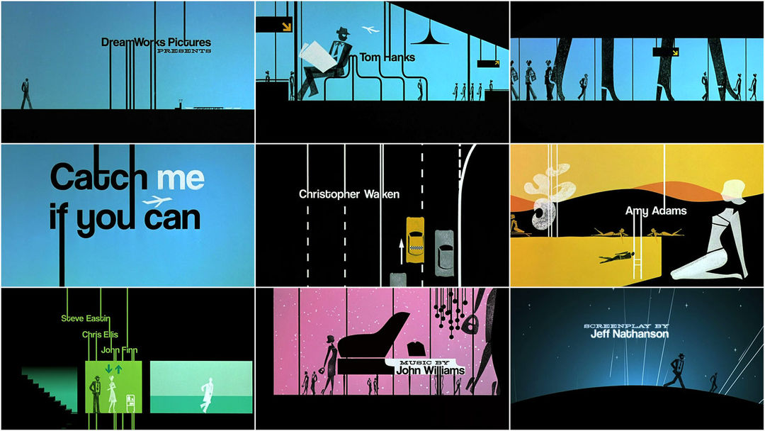
In today's lesson we focused on typography. We looked at films of different genres and discussed how the credits fit into those genres, as well as the size and colour of the font, and where they were placed on the screen.
Firstly, we looked at Catch Me If You Can (2002). This placed two different fonts next to each other. The serif font reminded us of a typewriter, which we thought could relate to Tom Hank's character of a policeman. This was because he would have had to type up reports on a typewriter, also relating to the time period the film is set in. The second font was a sans serif font, which was used to create parts of the images on screen. It is much more fluent than the serif font; changing and flowing into different objects. This could represent Leonardo DiCaprio's character, as he is a con artist and constantly changing professions and identities.
The fonts change positions frequently on the screen, yet nearly always keep to the same size. They are placed at the sides of the screen a lot, to allow the audience to focus on the images telling the story.
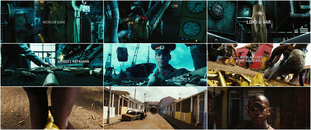
Lord of War (2005) was the second title sequence we discussed. It had very blocky, square font which was all in capitals and sans serif. This would usually make the credits the focus point of the title sequence, yet they were considerably small to allow the audience to focus on the things happening on screen, like Catch Me If You Can. The exception to this small font was of course the title of the film, which was larger than the other credits and centered. Unlike Catch Me If You Can, the credits were completely separate to the action, placed in various spaces on the screen where there was either little or no action.
The last title sequence we viewed was Forrest Gump (1994). The genre of this film is drama/romance, therefore has a centered serif font, which fades in and out. The text is very plain, possibly connoting the main character.
We also established that serif fonts are considered formal, posh, classic and timeless. In my title sequence, I will use a sans serif font. As my genre is a psychological thriller/horror film, not matching any of the films we looked at, I will use a scratchy font that conveys this.
After our group feedback and looking at title sequences similar to our film genre, we considered what we had been told/seen and continued with our storyboards. We focused on hinting our plot twist by showing more obvious pictures very quickly (for example, an extreme close up of a sliced neck with blood), and added these into our storyboards.
Due to missing a double lesson on Wednesday, we continued with our storyboards. We redrew our draft and rearranged some shots. We also added in where our credits would be placed and the name of the shots we would use.
This week we looked at receiving feedback about our film and title sequence ideas from our target audience. Our homework was to do this in the form of questionnaires. We created a questionnaire composed of 10 questions and handed it out to people that fit in our primary and secondary target audience; males and females aged 15-25.
Here are our questionnaires filled out by our target audience:
Today we also had group feedback with one of our teachers. We had to discuss our film and title sequence ideas so far. This is our recording of the conversation:
In today's lesson we focused on typography. We looked at films of different genres and discussed how the credits fit into those genres, as well as the size and colour of the font, and where they were placed on the screen.
Firstly, we looked at Catch Me If You Can (2002). This placed two different fonts next to each other. The serif font reminded us of a typewriter, which we thought could relate to Tom Hank's character of a policeman. This was because he would have had to type up reports on a typewriter, also relating to the time period the film is set in. The second font was a sans serif font, which was used to create parts of the images on screen. It is much more fluent than the serif font; changing and flowing into different objects. This could represent Leonardo DiCaprio's character, as he is a con artist and constantly changing professions and identities.
The fonts change positions frequently on the screen, yet nearly always keep to the same size. They are placed at the sides of the screen a lot, to allow the audience to focus on the images telling the story.
Lord of War (2005) was the second title sequence we discussed. It had very blocky, square font which was all in capitals and sans serif. This would usually make the credits the focus point of the title sequence, yet they were considerably small to allow the audience to focus on the things happening on screen, like Catch Me If You Can. The exception to this small font was of course the title of the film, which was larger than the other credits and centered. Unlike Catch Me If You Can, the credits were completely separate to the action, placed in various spaces on the screen where there was either little or no action.
The last title sequence we viewed was Forrest Gump (1994). The genre of this film is drama/romance, therefore has a centered serif font, which fades in and out. The text is very plain, possibly connoting the main character.
We also established that serif fonts are considered formal, posh, classic and timeless. In my title sequence, I will use a sans serif font. As my genre is a psychological thriller/horror film, not matching any of the films we looked at, I will use a scratchy font that conveys this.
This week we created a brainstorm of initial ideas for our title sequence. We focused on the STINCS abbreviation for the codes and conventions - setting, theme, iconography, narrative, structures, and style. We also looked at films of the same genre and decided we would research about their title sequences.
Today we were introduced to Roland Barthes, who came up with a theory that suggests a text and poses questions to the audience. He thought that all narratives share structural features that are brought together in different ways.
He came up with five enigma codes to group signifiers according to the role they play in the text:
The Hermenentic Code: The voice of truth.
This is the way the story avoids telling the truth or revealing all the facts, in order to drop clues throughout to create mystery.
The Proairetic Code: The voice of empirics.
This is the way the tension is built up and the audience is left guessing what happens next.
The Semantic Code: The voice of the person.
This is the way elements in the text can suggest a particular and often additional meaning, connoting what the story suggests.
The Symbolic Code: The voice of the symbol.
This is similar to the Semantic Code, but in a broader way. This is typically done where new meaning arises out of opposing and conflicting ideas.
The Cultural Code: The voice of knowledge.
This looks at the audience's wider cultural knowledge, morality and ideology.
Readerly and Writerly Texts
Barthes thought that most texts were 'readerly' texts. These texts' style and content are represented in the traditional linear way, meaning the audience is simply receiving the information presented to them. They attempt to give one meaning instead of multiple ones, commonly seen in advertising.
On the other hand, 'writerly' texts are the opposite and reveal the elements 'readerly' texts don't show. These texts put the audience in control, trying to determine the meaning of the text. The 'writerly' texts tend to undermine the reader's expectations.
The sequence begins with a plain white screen and black text appears in capital letters, informing us of the production company. It does not begin with a scene from the film like many title sequences usually do. This does not give much away and therefore creates suspense, fitting to the thriller genre of the film.
The text fades away and a red droplet falls in time with music. You immediately assume the droplets are blood, connoting death and violence, relating to the plot. The plain white background allows the audience to focus on the credits and droplets of blood as the colours contrast against each other.
As more important credits are shown, the pace of the music quickens and the drops keep in time with it, so more than one appear on the screen. This faster pace builds tension for the audience, possibly hinting at a chaotic plot or character.
Two droplets then splatter onto the white background, and the title of the film appears in the same font, with the second word in bold. This again hints at the plot and genre of the film.
The red droplets change to a constant red substance running, still resembling blood and adding to the tense atmosphere created by the faster music. This then cuts to the substance being drawn over a white surface, seeming to go against the idea that it is blood. However, the audience is still unsure what it is, therefore keeping the suspense.
A hand holding a large knife is lifted swiftly upwards on the screen as the name 'Christian Bale' appears, the star of the film. This suggests he is the antagonist and murderer. The knife is then slammed down to cut meat that looks like flesh, and a loud thud is heard which contrasts against the orchestral music and startles the audience. Again, this feeds into the idea of the thriller genre and foreshadows the audience will experience more shocks.
'Williem Dafoe' then appears, another well known actor and star of the film, keeping with the same font style. What seemed like blood and flesh now changes to show food, such as raspberries, clearly. This makes the audience backtrack and feel like they have let their imaginations go wild, linking to the ambiguous ending of the film.
The full plate of food is finally shown, with hands picking it up to be served. It is very neat and professional looking, hinting at the character's personality, as we find out he has OCD.
A birds eye shot shows the food is placed down on a table and the camera pans at an angle to show another meal. The audience views the meals upside down, creating disorientation.
The table shots cut to mid-shots of people eating in a restaurant and a waiter serving food. They are dressed in evening clothes and the waiter is wearing a white suit with a bow tie, showing they are wealthy and of high status. This suggests the film focuses on characters of this social background. The orchestral music continues yet changes to a happier tone. This compares the room where the food was being prepared (the kitchen) and the main part of the restaurant where people are eating, giving the idea that there is a secret and a defined separation between the two. This is because the kitchen shows emptiness and a cold feeling due to a lack of colour, besides the bright red droplets, and no people besides the hand holding the knife. In comparison, the restaurant is full of people talking and bright colours, such as pink and green.
This changes to a birds eye view of a woman cutting into a dessert. The contrasting colours of white and red reappear, connoting more blood and violence. The woman is also wearing a black evening glove, a colour associated with death.
Characters of the film are finally shown by an over the shoulder shot, starting with the star Christian Bale and his friends/work colleagues having a conversation with banter. The credits are still shown in the same font, yet as the most important names such as the production companies, director and stars have been shown, the audience are now more focused on the film rather than the credits. This allows a fluent transition from the title sequence into the beginning of the film.
Overall, it is a very effective title sequence as it plays with the minds of the audience. It constantly hints at the plot and character, yet does not make it too obvious, therefore allows you to make assumptions which you will have to watch to find out. I also like the use of colour to connote the genre and timing parts of it with music, which I would be interested in trying with my title sequence.