Week 5: Wednesday
In today's lesson we focused on typography. We looked at films of different genres and discussed how the credits fit into those genres, as well as the size and colour of the font, and where they were placed on the screen.
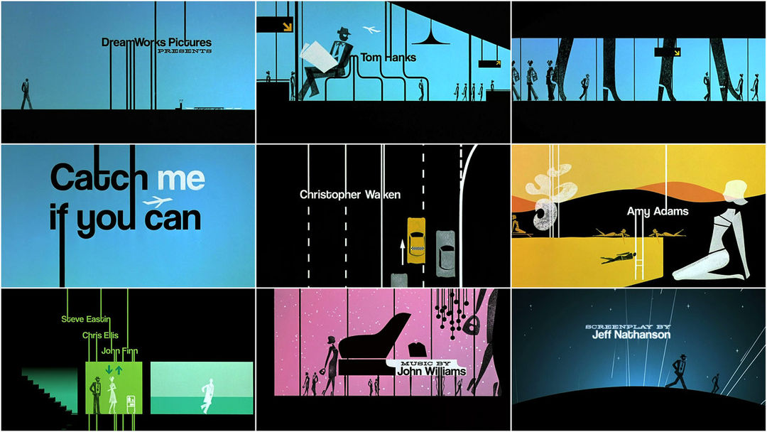
Firstly, we looked at Catch Me If You Can (2002). This placed two different fonts next to each other. The serif font reminded us of a typewriter, which we thought could relate to Tom Hank's character of a policeman. This was because he would have had to type up reports on a typewriter, also relating to the time period the film is set in. The second font was a sans serif font, which was used to create parts of the images on screen. It is much more fluent than the serif font; changing and flowing into different objects. This could represent Leonardo DiCaprio's character, as he is a con artist and constantly changing professions and identities.
The fonts change positions frequently on the screen, yet nearly always keep to the same size. They are placed at the sides of the screen a lot, to allow the audience to focus on the images telling the story.
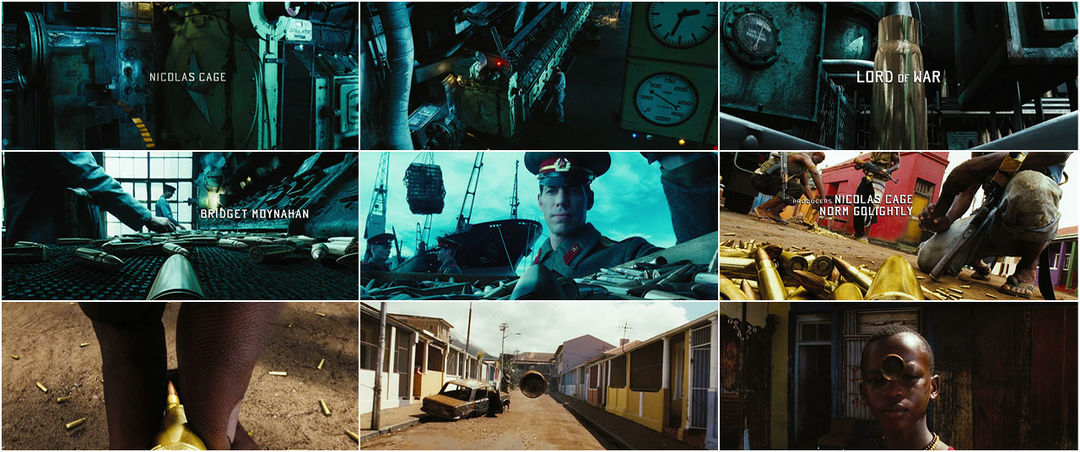
Lord of War (2005) was the second title sequence we discussed. It had very blocky, square font which was all in capitals and sans serif. This would usually make the credits the focus point of the title sequence, yet they were considerably small to allow the audience to focus on the things happening on screen, like Catch Me If You Can. The exception to this small font was of course the title of the film, which was larger than the other credits and centered. Unlike Catch Me If You Can, the credits were completely separate to the action, placed in various spaces on the screen where there was either little or no action.
The last title sequence we viewed was Forrest Gump (1994). The genre of this film is drama/romance, therefore has a centered serif font, which fades in and out. The text is very plain, possibly connoting the main character.

We also established that serif fonts are considered formal, posh, classic and timeless. In my title sequence, I will use a sans serif font. As my genre is a psychological thriller/horror film, not matching any of the films we looked at, I will use a scratchy font that conveys this.
