I'm Lucy, 17 years old and studying A Levels at Welling Sixth Form. Here you'll find my coursework for Media as I look at title sequences and eventually create my own.
This week we created a brainstorm of initial ideas for our title sequence. We focused on the STINCS abbreviation for the codes and conventions - setting, theme, iconography, narrative, structures, and style. We also looked at films of the same genre and decided we would research about their title sequences.
Today we were introduced to Roland Barthes, who came up with a theory that suggests a text and poses questions to the audience. He thought that all narratives share structural features that are brought together in different ways.
He came up with five enigma codes to group signifiers according to the role they play in the text:
The Hermenentic Code: The voice of truth.
This is the way the story avoids telling the truth or revealing all the facts, in order to drop clues throughout to create mystery.
The Proairetic Code: The voice of empirics.
This is the way the tension is built up and the audience is left guessing what happens next.
The Semantic Code: The voice of the person.
This is the way elements in the text can suggest a particular and often additional meaning, connoting what the story suggests.
The Symbolic Code: The voice of the symbol.
This is similar to the Semantic Code, but in a broader way. This is typically done where new meaning arises out of opposing and conflicting ideas.
The Cultural Code: The voice of knowledge.
This looks at the audience's wider cultural knowledge, morality and ideology.
Readerly and Writerly Texts
Barthes thought that most texts were 'readerly' texts. These texts' style and content are represented in the traditional linear way, meaning the audience is simply receiving the information presented to them. They attempt to give one meaning instead of multiple ones, commonly seen in advertising.
On the other hand, 'writerly' texts are the opposite and reveal the elements 'readerly' texts don't show. These texts put the audience in control, trying to determine the meaning of the text. The 'writerly' texts tend to undermine the reader's expectations.
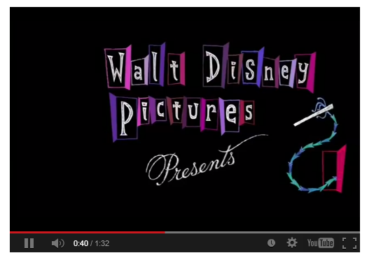
The sequence begins with a plain white screen and black text appears in capital letters, informing us of the production company. It does not begin with a scene from the film like many title sequences usually do. This does not give much away and therefore creates suspense, fitting to the thriller genre of the film.
The text fades away and a red droplet falls in time with music. You immediately assume the droplets are blood, connoting death and violence, relating to the plot. The plain white background allows the audience to focus on the credits and droplets of blood as the colours contrast against each other.
As more important credits are shown, the pace of the music quickens and the drops keep in time with it, so more than one appear on the screen. This faster pace builds tension for the audience, possibly hinting at a chaotic plot or character.
Two droplets then splatter onto the white background, and the title of the film appears in the same font, with the second word in bold. This again hints at the plot and genre of the film.
The red droplets change to a constant red substance running, still resembling blood and adding to the tense atmosphere created by the faster music. This then cuts to the substance being drawn over a white surface, seeming to go against the idea that it is blood. However, the audience is still unsure what it is, therefore keeping the suspense.
A hand holding a large knife is lifted swiftly upwards on the screen as the name 'Christian Bale' appears, the star of the film. This suggests he is the antagonist and murderer. The knife is then slammed down to cut meat that looks like flesh, and a loud thud is heard which contrasts against the orchestral music and startles the audience. Again, this feeds into the idea of the thriller genre and foreshadows the audience will experience more shocks.
'Williem Dafoe' then appears, another well known actor and star of the film, keeping with the same font style. What seemed like blood and flesh now changes to show food, such as raspberries, clearly. This makes the audience backtrack and feel like they have let their imaginations go wild, linking to the ambiguous ending of the film.
The full plate of food is finally shown, with hands picking it up to be served. It is very neat and professional looking, hinting at the character's personality, as we find out he has OCD.
A birds eye shot shows the food is placed down on a table and the camera pans at an angle to show another meal. The audience views the meals upside down, creating disorientation.
The table shots cut to mid-shots of people eating in a restaurant and a waiter serving food. They are dressed in evening clothes and the waiter is wearing a white suit with a bow tie, showing they are wealthy and of high status. This suggests the film focuses on characters of this social background. The orchestral music continues yet changes to a happier tone. This compares the room where the food was being prepared (the kitchen) and the main part of the restaurant where people are eating, giving the idea that there is a secret and a defined separation between the two. This is because the kitchen shows emptiness and a cold feeling due to a lack of colour, besides the bright red droplets, and no people besides the hand holding the knife. In comparison, the restaurant is full of people talking and bright colours, such as pink and green.
This changes to a birds eye view of a woman cutting into a dessert. The contrasting colours of white and red reappear, connoting more blood and violence. The woman is also wearing a black evening glove, a colour associated with death.
Characters of the film are finally shown by an over the shoulder shot, starting with the star Christian Bale and his friends/work colleagues having a conversation with banter. The credits are still shown in the same font, yet as the most important names such as the production companies, director and stars have been shown, the audience are now more focused on the film rather than the credits. This allows a fluent transition from the title sequence into the beginning of the film.
Overall, it is a very effective title sequence as it plays with the minds of the audience. It constantly hints at the plot and character, yet does not make it too obvious, therefore allows you to make assumptions which you will have to watch to find out. I also like the use of colour to connote the genre and timing parts of it with music, which I would be interested in trying with my title sequence.
One of the sequences I looked at was Anatomy of a Murder (1959).
For my homework I created a powerpoint about Saul Bass and analysed this title sequence within it. I tried to incorporate Bass' style and used a Prezzi design with bold, colourful triangles.
We were introduced to an abbreviation to help us remember the codes and conventions of a title sequence: STINCS.
Setting - When and where is the film set?
Theme - The mood of the film, what is it really about?
Iconography - Costume, props, make-up, etc.
Narrative - What is the film about?
Characters - Who are they? What are they like?
Style - Cinematography, sound, editing, etc.
We then focused on sound for the rest of the lesson. We looked at how it helped set the tone for the film. We rewatched the Se7en (1995) title sequence, focusing on the various sounds within it and how they might have been created. For example, there is a almost screeching sound I thought sounded like the noise made by moving a pick down an electric guitar string when it is plugged in. Other title sequences we looked at were Vertigo (1958) and Catch Me If You Can (2002).
After, we separated into groups and tried collecting sounds from within the classroom and around the school.
We looked at a powerpoint about the American graphic designer and title sequence designer Saul Bass. He is considered to have revolutionised the title sequence and influenced many other designers.
We were then given a list of designers and had to choose one to research for a presentation to the rest of the class. These were:
Kyle Cooper
Richard Morrison
Danny Yount
Karin Fong
Paul Donnella
Bob Kurtz
My group chose Kyle Cooper as we had recently looked at his work for Se7en (1995) in class.
The title sequence immediately gives a light-hearted feeling. Different plates of food are placed on brightly coloured carpets, with the titles written in sauces on the plates. The carpets hint at when the film is set, the 80s. The colours are vibrant and contrast against each other, suggesting a happy tone to the film, therefore showing it is of the comedy genre. The type of food also hints that the audience is teenagers, as it involves simple meals like chicken nuggets and school dinners.
After a few plates are placed down with a diegetic 'thunking' sound and then removed, an upbeat alternative background song begins, again suggesting the comedy genre. The carpet changes colour back to the original and a wallet is opened, staying with the same point of view shot which does not change throughout the title sequence. A diegetic velcro sound is heard when the wallet is opened. A card is pulled out, showing 'U.F.O Abduction Insurance', suggesting the main character is a geek as he conforms to the stereotype of geeks being interested and believing in aliens. Another card is shown, this time a school ID card for the main character. His appearance confirms he is a typical geek, with big glasses and curly hair. The titles for the main stars are cleverly placed on both these cards, revealing their character's personalities.
Today we looked further into title sequences. A title sequence is the method a film credits production and cast members using visuals and sound. Many title sequences aim to establish character, setting, genre, mood or atmosphere. Common Credits are:
Production Companies
Producer
Title
Director
Other key crew
Executive producer
Top billing actors
There are also different conventions for title sequences which are usually split into three parts.
Technical convention: Actual techniques used, e.g: cinematography, mise-en-scene, editing, sound.
Symbolic convention: Objects shown with deeper connotations/meanings.
Genre convention: Things that hint what genre the film is.
We looked at several title sequences. These were:
The Avengers (1998)
Hulk (2003)
Se7en (1995)
Napoleon Dynamite (2004)
Juno (2007)
We discussed how the elements of mise-en-scene, sound, editing and cinematography all come together to set the mood for the film. We found they sometimes tell the story and give hints about what is going to happen.
We then looked at the credit timeline for Juno (2007). This showed us what credits appeared on the screen and what time.
After looking at a title sequence of our choice, we created our own version of this. I looked at one of my favourite films, Zombieland (2009).
The Look of Saul Bass (2004) — Art of the Title A short documentary with Kyle Cooper I found interesting. My group looked at both of these title sequence designers. They are considered to have revolutionised the title sequence and have influenced many other designers.
I think it's amazing how much title sequences have developed over the years. They have changed from very plain and basic old-fashioned designs like D.W. Griffith’s 'Intolerance' (1916), providing only the essential information for the audience.
Nowadays, there are various images and even whole scenes that create the title sequence. These are used to show the genre of the film, possibly hinting at the plot too. There are also many more names included, due to how films have grown and therefore more people are needed to make them.
Monsters Inc. has always been one of my favourite title sequences, even when I was younger. However, it is not until now how I realise how similar it is to the older, more traditional title sequences that show the basic information. The Monsters Inc. titles do this in a more colourful and animated way, in time with music.
The Bond title sequences are iconic. Typography that 'interacts with metaphorical imagery or to create its own world' is a great technique used for opening sequences. I feel it helps set a certain mood for the film and engages the audience.
It seems the more creative a title sequence is, the more popular it becomes. As shown by the Bond and Pink Panther series. Graphic designers played a huge part in the development of title sequences and they possibly wouldn't have allowed film makers to be as experimentative.
In conclusion, title sequences have changed drastically, but in a positive way. They are much more engaging and can be crucial to set the tone of the film. Their development means the audience and other film makers can appreciate them more; still taking note of the essential information presented, yet also of the time and effort put into them while enjoying them.
On Monday I collected everyone's research and writing about their chosen points and put them together in a powerpoint, adding images. We met after I had done this and I explained the adjustments I had made while creating the powerpoint. These were adding to the story line and increasing the budget as we had changed the films we had researched into.
The feedback we were given was fair. Our teacher liked our idea, yet thought we needed to decide whether we were going for a stereotypical horror film or to go down a more 'indie' route. The rest of my group were thinking of a stereotypical film, whereas I was aiming for an indie kind, which is why I think our pitch was not so successful. Our teacher and the group all agreed that the director, Ben Wheatley, also needed to be changed as he has only done one film that is similar to our genre (Kill List).
After both groups had given their pitches and received feedback, we had to change groups as there was another member of the class, Chloe, who was absent last week but did not want to work alone. I volunteered to change groups and my previous group allowed me to keep our work so far as the majority of the plot was my idea and thought it unfair to make just two of us recreate all the work from scratch.
After discussing the idea and research so far with Chloe, we chose to stick with an 'indie' psychological thriller/horror. I then researched further into directors, deciding on Jim Mickle. He is an upcoming American director, known for Stake Land (2010), Mulberry St (2006) and We Are What We Are (2013). Two of these films fall into our genres of thriller/horror.
These are our updated slides after the changes we made:
This week we were put into two groups and given our coursework task; to create an opening title sequence of a new fiction film, lasting no longer than 2 minutes. My group was made up of myself, Laxmi, Hayley and Aaron. As a starting point, we brainstormed the genres of films and then branched into more specific ideas and plots to do with the different genres. After brainstorming ideas and deciding on one, we were given 8 points to cover for a film pitch we would deliver to the class next lesson. As there were 4 of us, we decided to share them fairly and cover 2 points each. We were going to complete this over the weekend and have a team meeting on Monday before the pitch to discuss what we had so far. Exam Marking:
Continuity editing is an editing technique that shows continuous action within a scene and making it appear natural. It is also referred to as 'invisible' editing. We were given a task to create a scene showing continuity editing. Within this scene we had to include the following things: - A person crossing a room - Two people having a conversation - A person opening a door
The scene begins with a wide shot, showing two people sitting opposite each other as the brief instructed. They exchange a few lines of dialogue, using shot-reverse-shot between them, one of the invisible editing techniques. This also keeps to the 180-degree rule. After a shoot out, the remaining character stands and picks up the bag, as shown by the seamless cut from an over the shoulder shot to a wide shot. The character then walks across the room, opening a door and walking out into the corridor. The opening of the door and stepping out demonstrates the match on action, making the two separate parts seem like one fluent motion. The fluent movement continues as the character walks towards the camera and out of shot, cutting to a wide shot of the corridor as the character walks down it, away from the camera. As he walks, it fades to black to end the scene.